
The CEO’s office carries out the business of the county and initiatives set forth by an elected Board of Supervisors. They required a brand that communicated confidently as a public department with the operational complexity, scope and budget that exceed many corporations.
Reddoor went through an extensive RFP process and was ultimately selected by the County to design a logo and develop a system that could help bring consistency across the large organization. As we dug into public stats about the County of Los Angeles we discovered the staggering size of the county and its infrastructure. You can see by the data below (as of 2023-2024), the County of Los Angeles truly rivals the size of states and even some countries:

Logo Animation
Logo and Brand Development
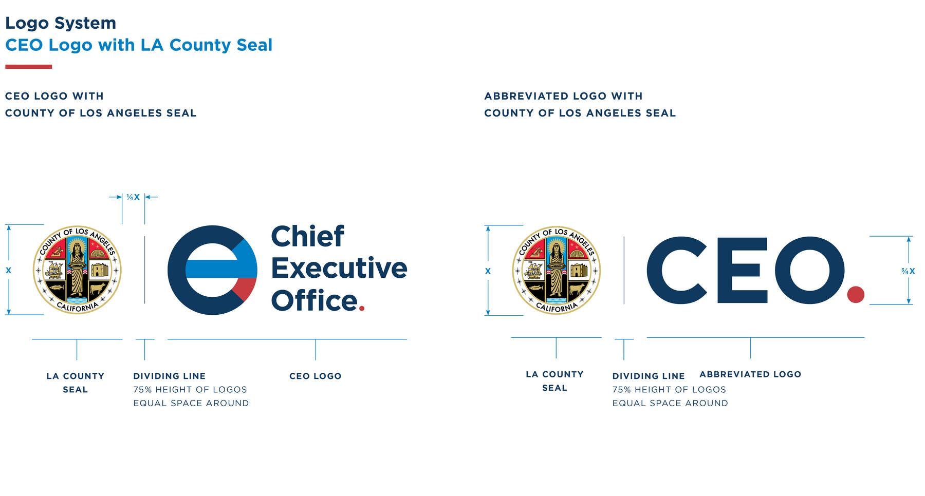
The logo was born out of a modern monogram/seal concept. It needed to hold its own next to the LA County seal while also living in harmony with it. We wanted to communicate the dual nature of being a public department operating at the scale of a major corporation. The brand's boldness is meant to stand confidently beside any Fortune 100 company.
A Period with a Purpose.
“The buck stops here.” was a phrase our team used internally when discussing how the Chief Executive Office is uniquely positioned in the County's overall structure. They are the final authority on budget recommendations before they are submitted to the Board of Supervisors. Design decisions led us to a visually distinct and strong red period signifying the “final word.”

Departments

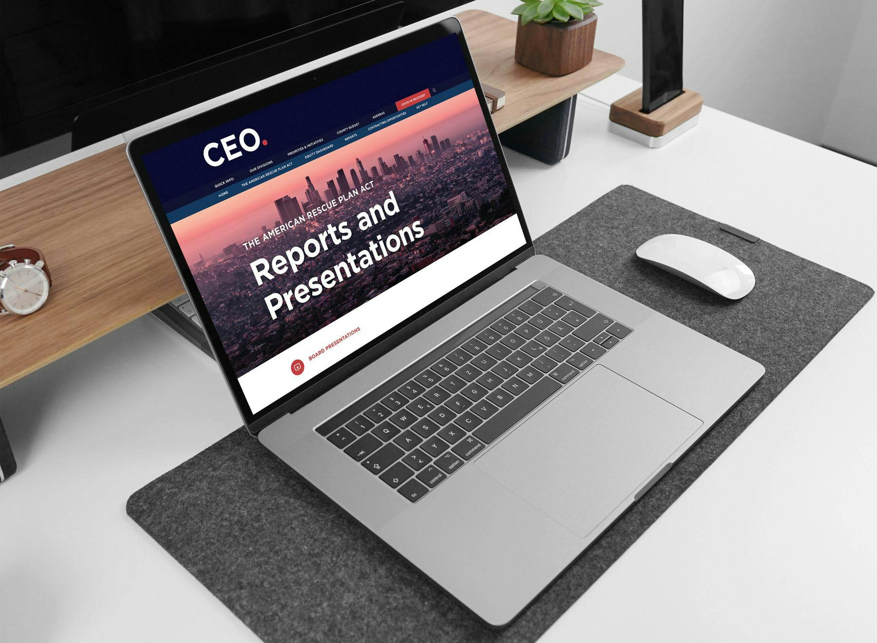
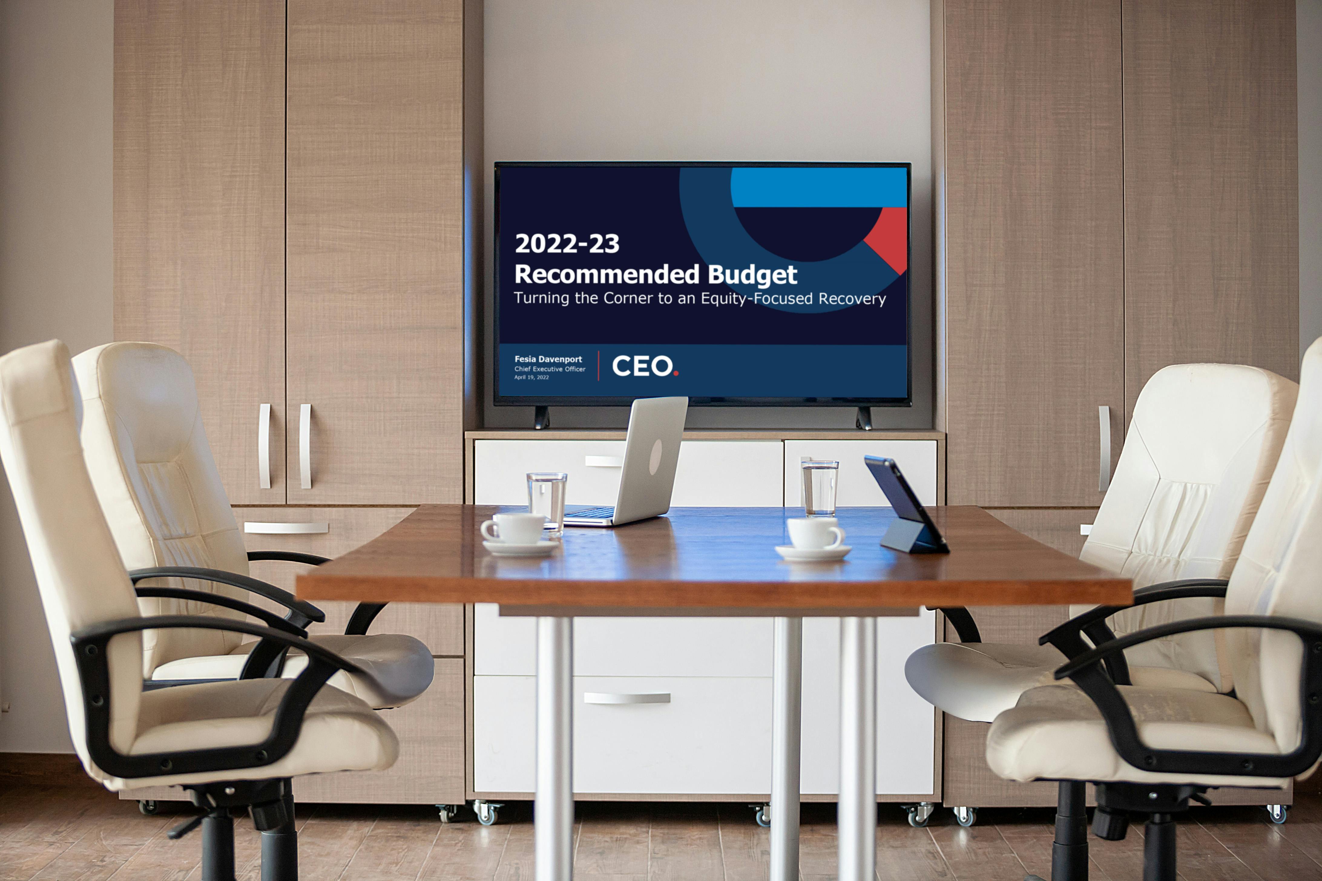
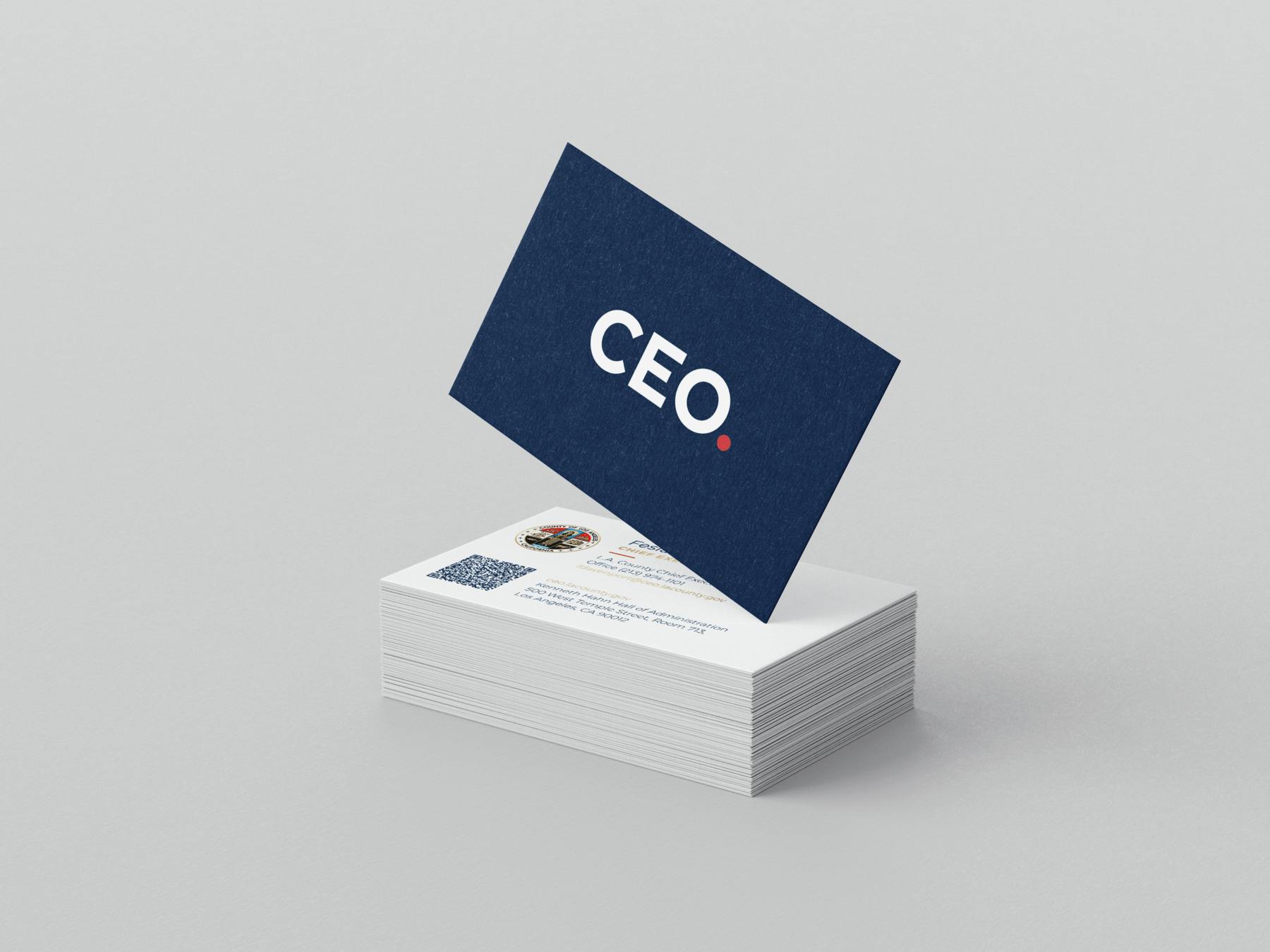
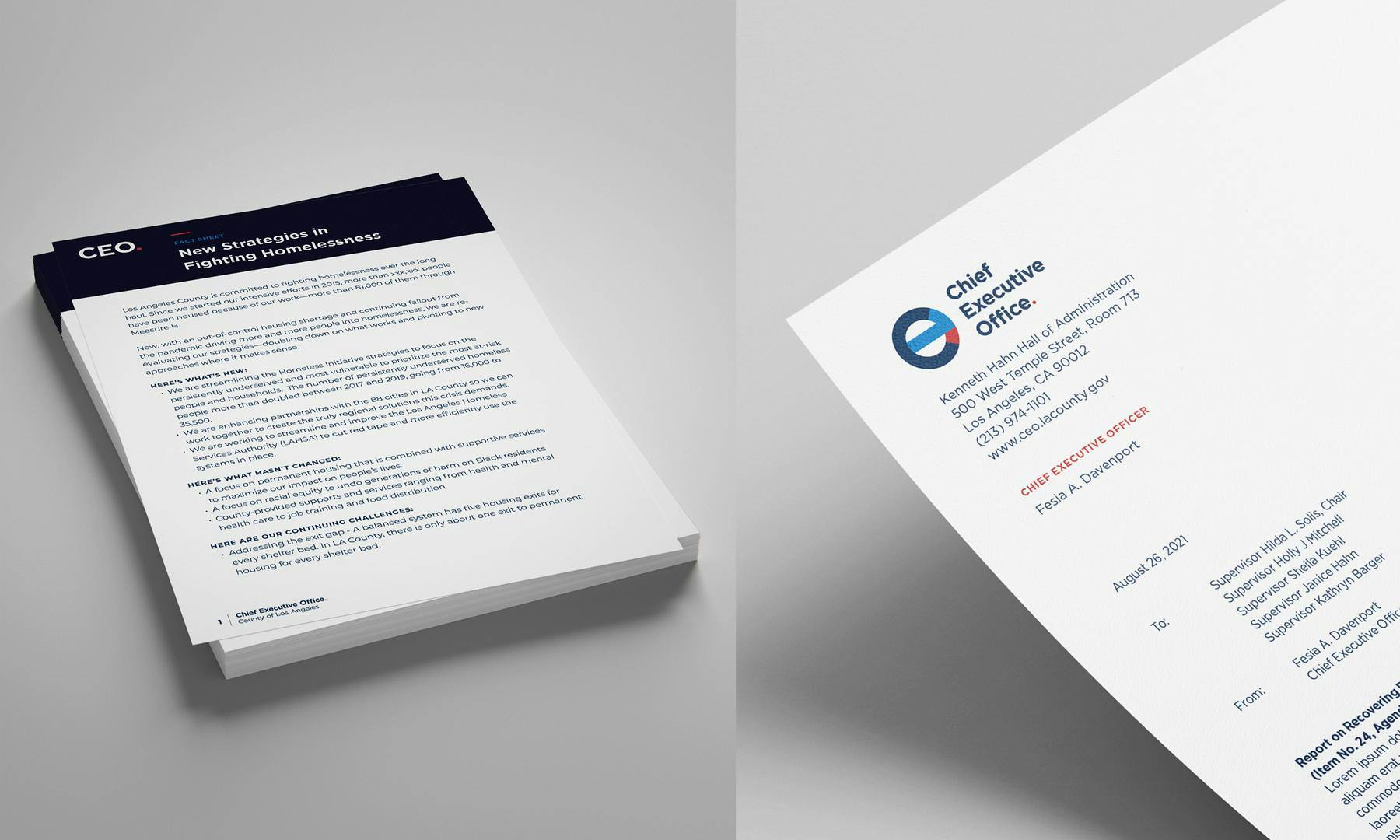
Branded Collateral
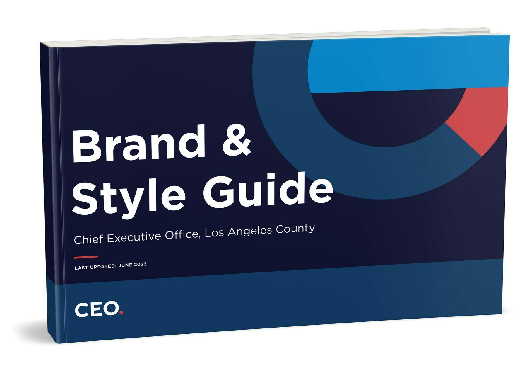
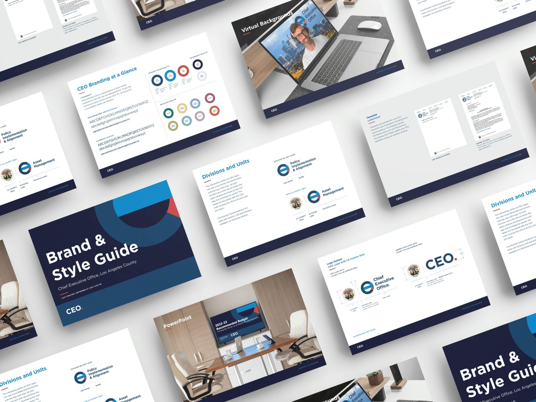
Brand & Style Guidelines
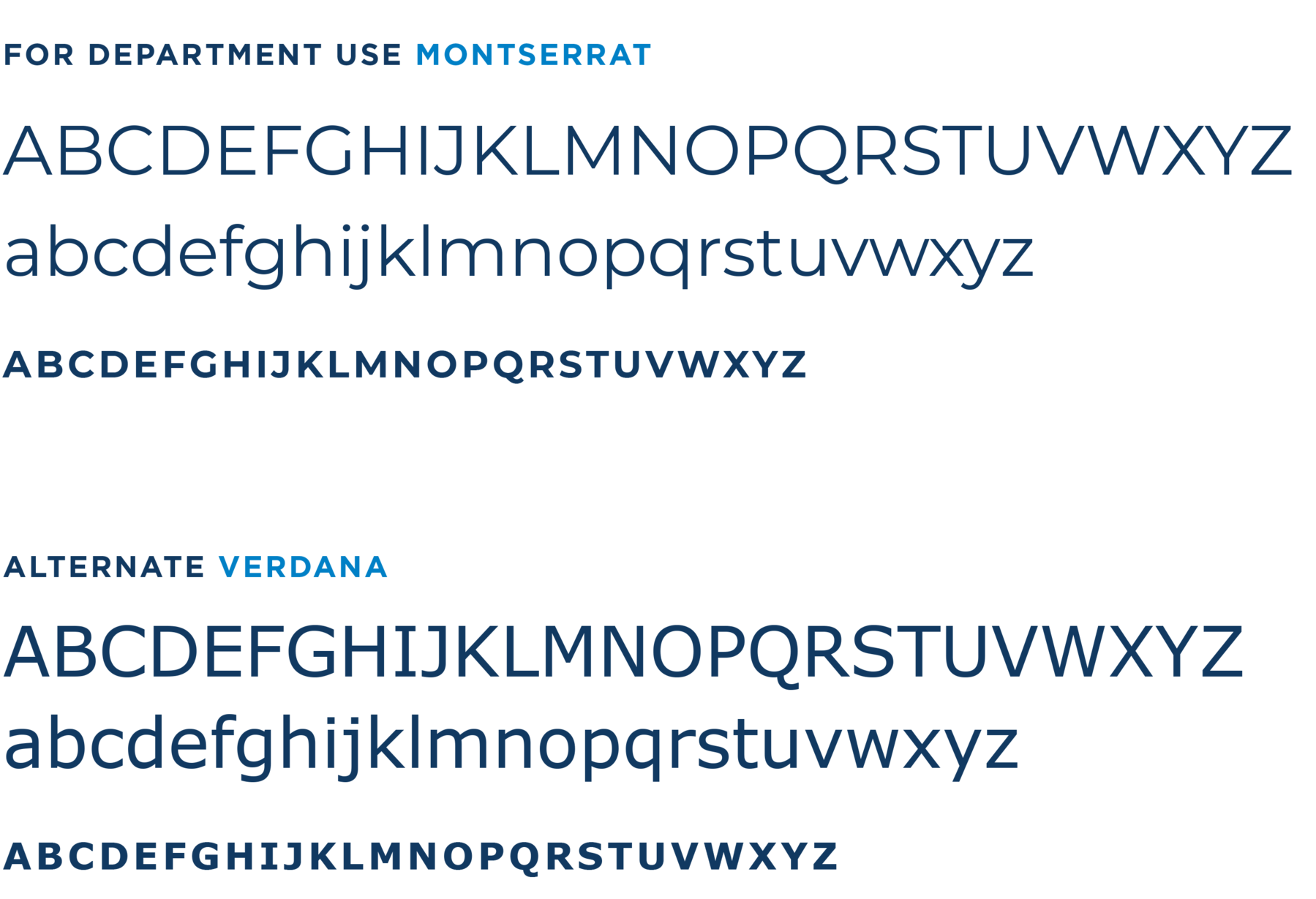
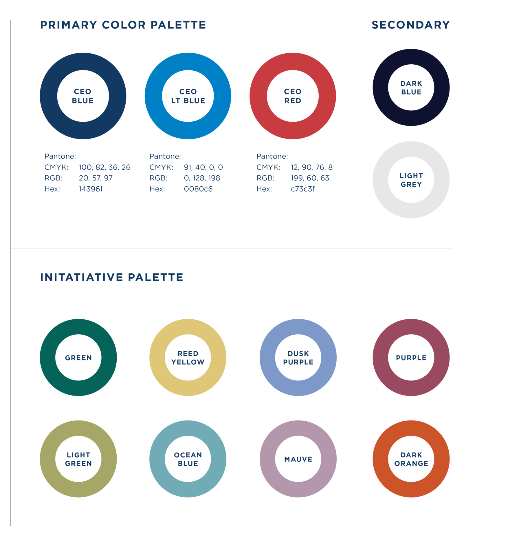
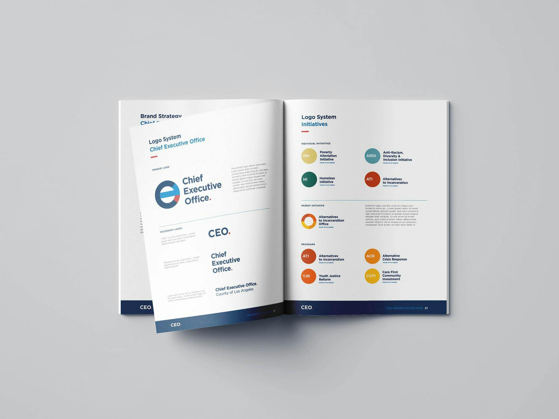
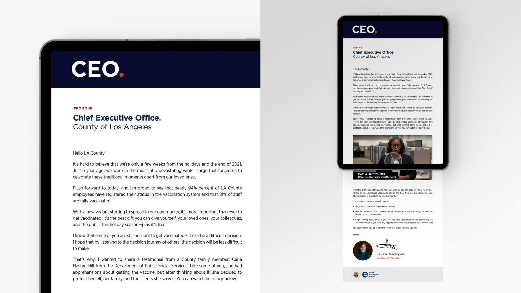
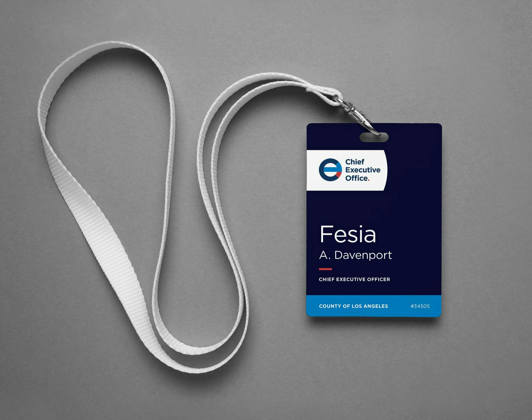
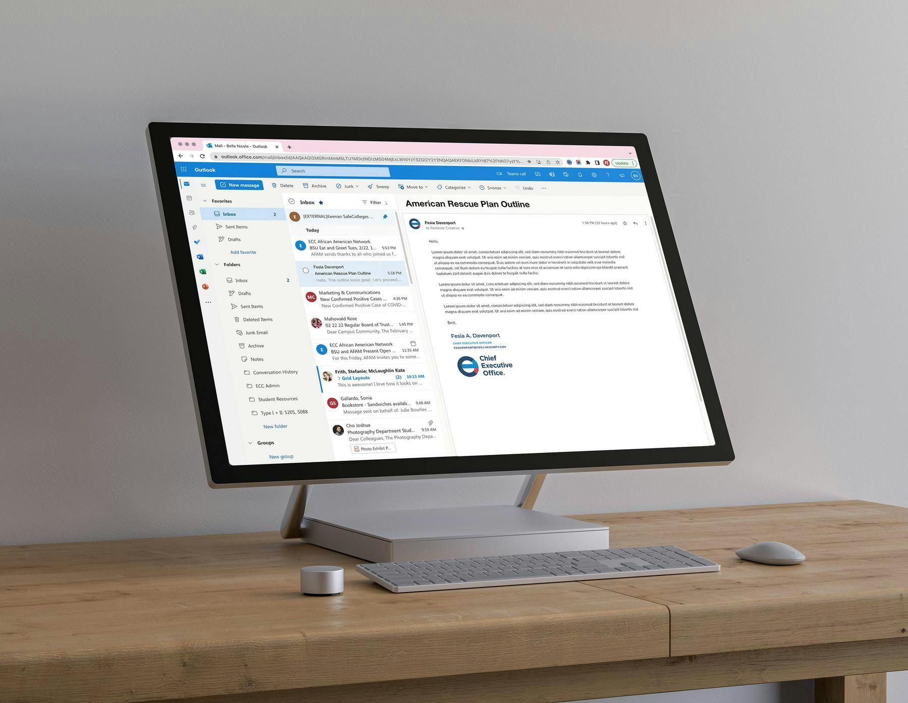
These guidelines are extensive, not only showing logo usage, color palettes and collateral examples but also giving guidance for department and initiative application of the brand.
County Initiatives
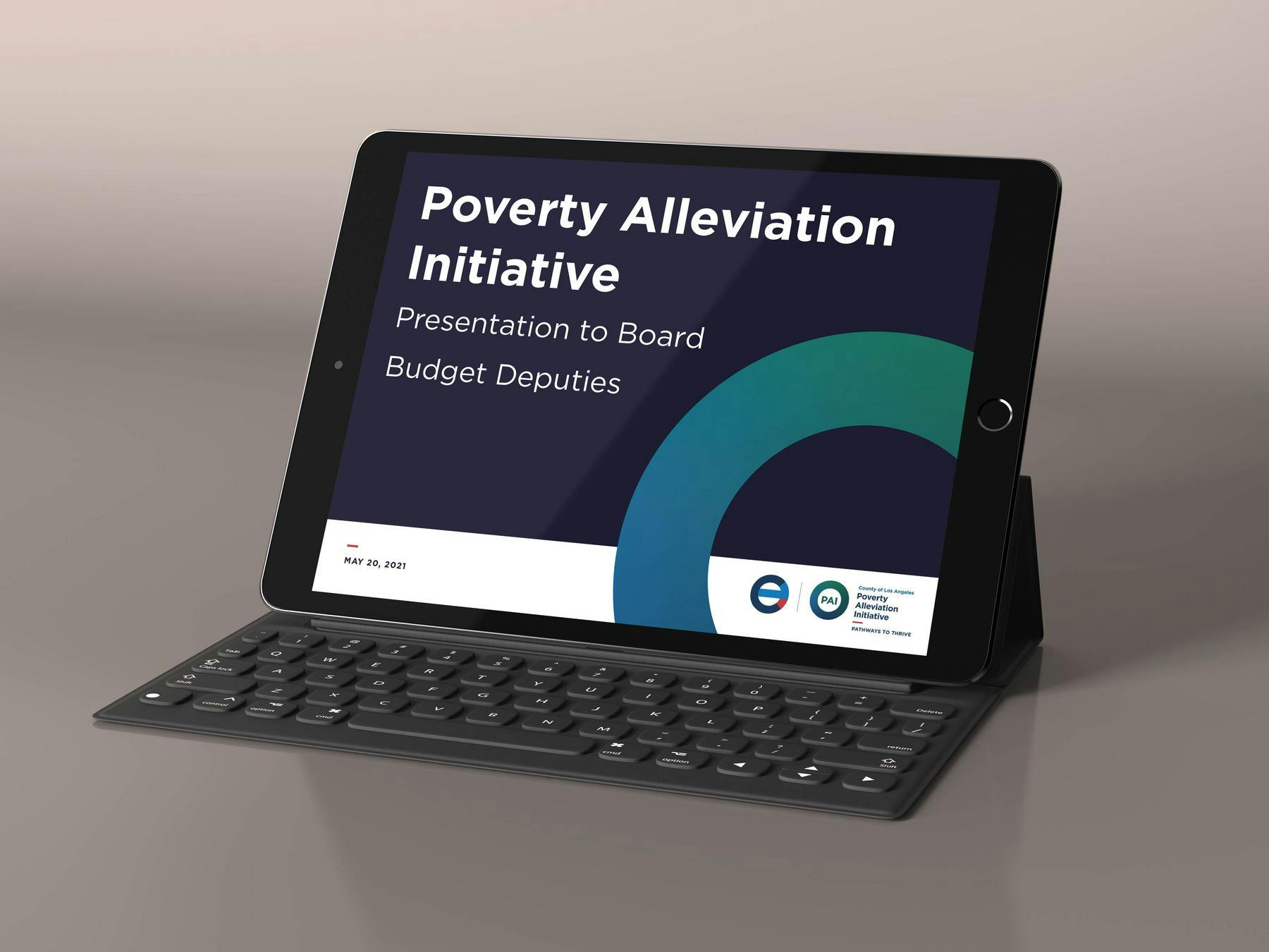
The CEO is in charge of implementing the Board of Supervisors' ambitious policy agenda. We needed a visual system that could help give the initiatives efficient and professional branding out of the gate.


Iconography
Since the CEO's office communicates with a wide range of internal and external audiences about the budget and other key priorities, a customized set of icons was developed to provide maximum clarity and flexibility.


